A curated list of digital specimens
of the highest quality. Updated daily.
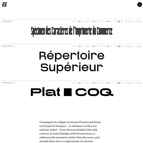
Compagnie
Excellent specimen for Compagnie from The Pyte Foundry. Stacked type testers with subtle controls open the specimen before progressing to just the right amount of content explaining the design history. Be sure to check out the PDF specimen for some lovely design work.
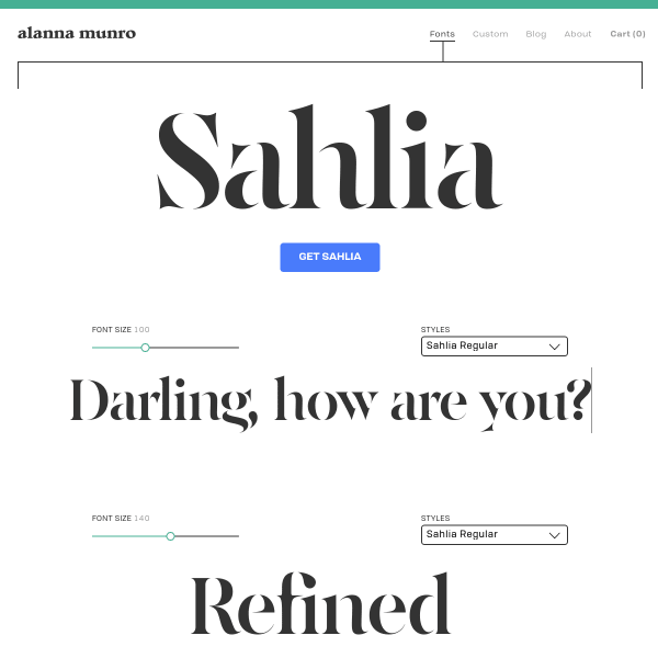
Sahlia
The standout for this specimen from Alanna Munro is the interaction design for purchasing the font. No dropdown, no complicated links off to Eulas and other legal-imposed barriers to purchase. Instead, elegantly designed, simple boxes to select your font package.
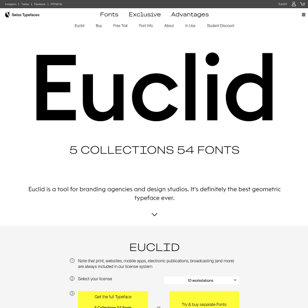
Euclid
The hierarchy for the Euclid specimen is a little challenging. Opening with licensing information and options to buy – which are always a multi-step process for buying fonts – the specimen proceeds with type testers.
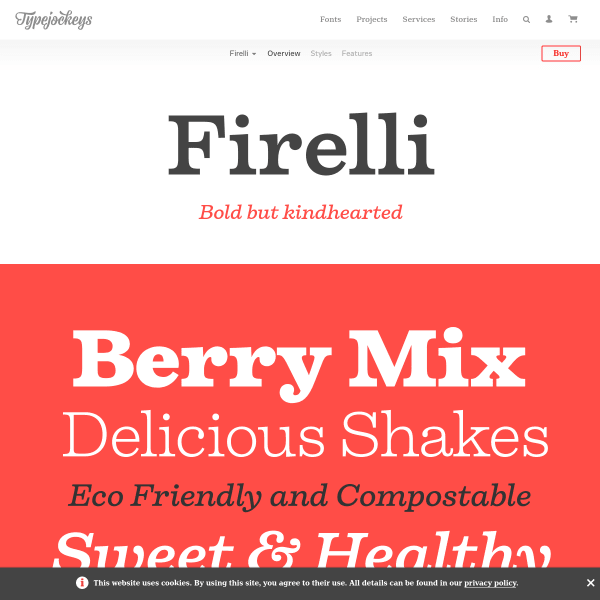
Firelli
A delicious specimen from Type Jockeys for Firelli. Continuing their two-tone colour palette and stacked fonts-in-use type examples, the type testers have some subtle ways of integrating with the design.
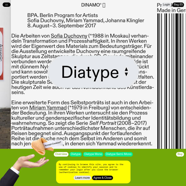
Diatype
There's a lot to like about this bold specimen for Diatype. A mix of photography and bright user interface makes for an exciting specimen. Bravely building on existing interface conventions, it includes many subtle animations and transitions. To see what I mean, check out the glyph table.
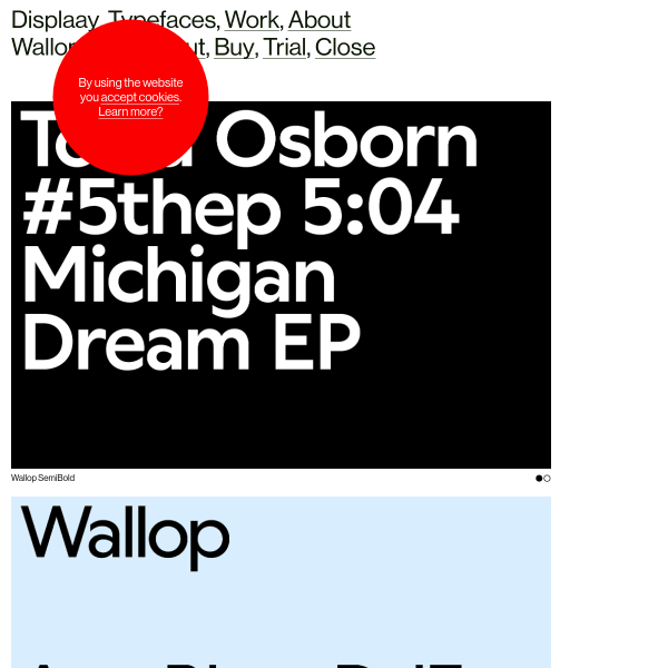
Wallop
Taking a 'page-based' approach to this specimen, Wallop includes many stacked carousels of SVG graphics. Light on the use of web fonts, the specimen concludes with a comprehensive type tester allowing the user to toggle stylistic sets and other OpenType features.
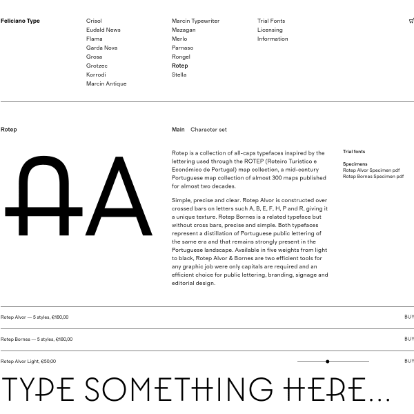
Rotep
This specimen from Feliciano Type for Rotep is a templated but effective specimen. Simple, with stacked type testers for every weight, it provides some much needed clarity for the user.
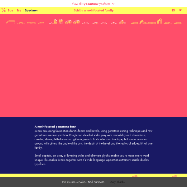
Schijn
A 'specimen of a glittering multifaceted gemstone font', the specimen is stacked images of example settings and contextual designs. What is notable is the striking colourways, and illustrations outlining this unique typeface's features.
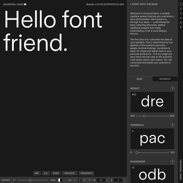
Universal Sans
This is a bit special. Part specimen, part font-building tool kit, part education. The specimen for Universal Sans walks the user through the creation of a variant of Universal Sans based on a user's preferences of weight, terminals, alternates, numerals etc. Then, the user is provided with options to buy the version they just specified.
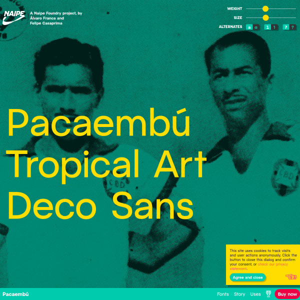
Pacaembú ⚽️
Opening with a full screen type tester, Pacaembú provides the most important tools to the user up front and centre. But the really interesting parts of this specimen follow it. So much interesting design - animations, illustrations, example and example of Pacaembú in use. Fantastic, bold design.
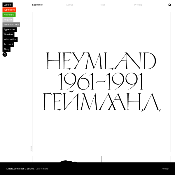
Heymland
Big, bold glyphs coupled with stark black and white illustrations, the specimen for Heymland features many vertically stacked specimen glyphs.
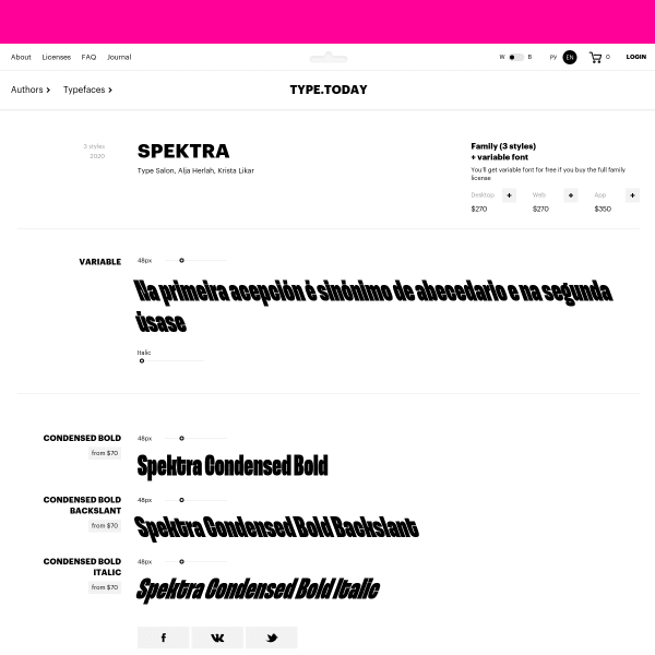
Spektra
An interesting variable italic on type.today. The specimen for Spektra follows the same minimal design as all of type.today's specimens, but don't let that fool you into thinking they aren't effective. Simple, paired back type testers give the user exactly what they need to evaluate the typeface.
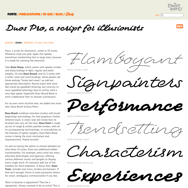
Duo Pro
A script with three different styles, the specimen for Duo Pro aims to show these off in simple two tone illustrations as much as possible. Organised as a micro site, rather than the conventional single page, the specimen nicely demonstrates the features of the font.
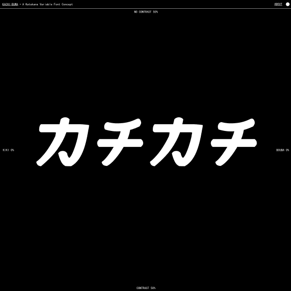
Kachi Buwa
This is an interesting specimen. A single type tester demonstrating a variable Japanese font on two axis: contrast, and between 'kiki' and 'bouba'. All visualised through some appropriate mouse-jacking.
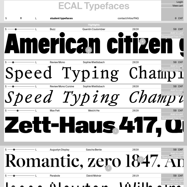
ECAL Typefaces
A single page of stacked type testers with tiny controls. The standout feature of these are the tiny rosettes positioned over typeface features. For example, an 'a' rosette toggles between an alternate lower case a. Nifty.
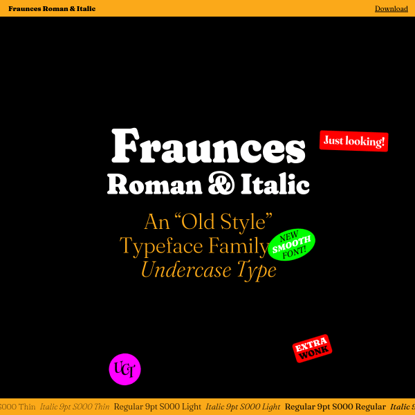
Fraunces
The opening screen for this specimen for Fraunes is loads of fun (I'll leave it to you to experiment and find out for yourself!). Many stacked components outlining and demonstrating features sit either side of a long form article outlingin the design. One stand out component is the comparison between optical sizing and without. Very smart.
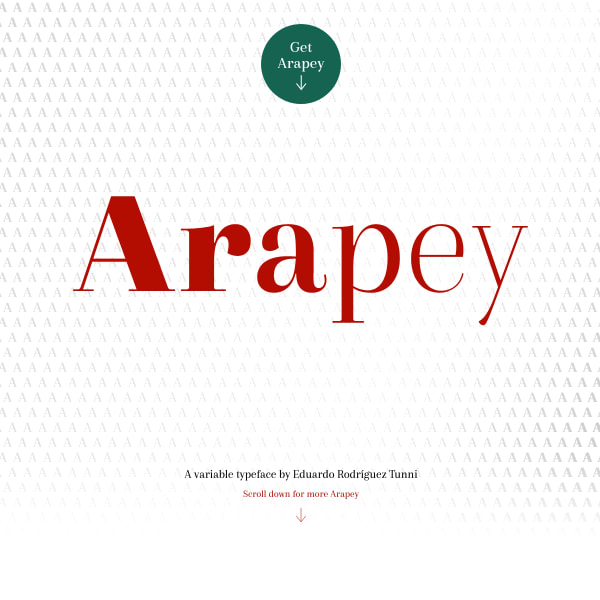
Arapey
A feature-rich specimen for Arapey comprised of numerous horizontally stacked interactive elements all wrapped around a simple, two tone design.
FORGE
An unusual specimen that dispenses with many conventions in favour of expression and experimentation. Illustrative and creative, it includes a really simple type tester and glyph list, but it's the framing illustrations that challenge the viewer.
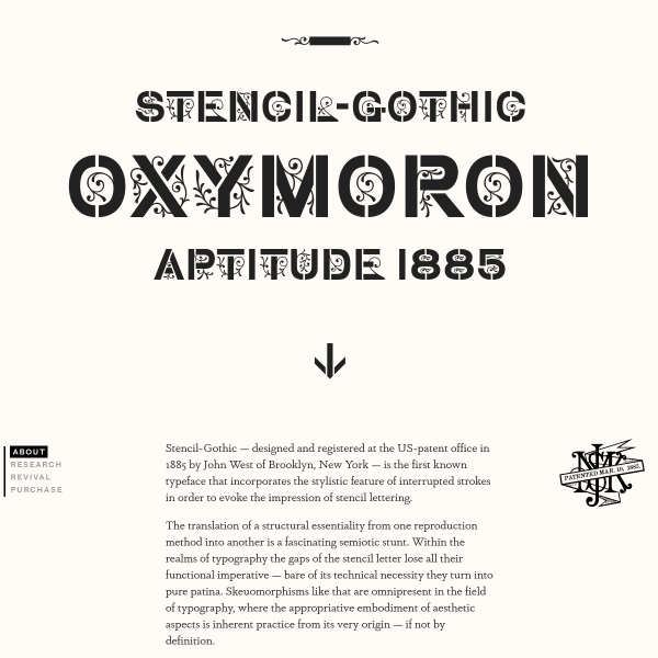
Stencil Gothic
A specimen that reads as a research project. The linear, scrolling story is punctuated by typographic illustrations and research photographs.
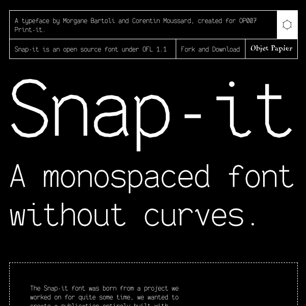
Snap-it
Snap it is a monospaced font without the curves. Because... why not? But underneath this quirky exterior is a typeface with considered and well-constructed form. The specimen in particular goes a long way in explaining the features.
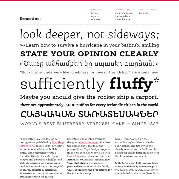
FF Ernestine
This specimen for FF Ernestine is a presented as a microsite in a traditional way. A homepage with hero image, introductory text, a page with all the glyphs. Whilst this could work very well for print, more is needed for digital. Maybe showing its age?
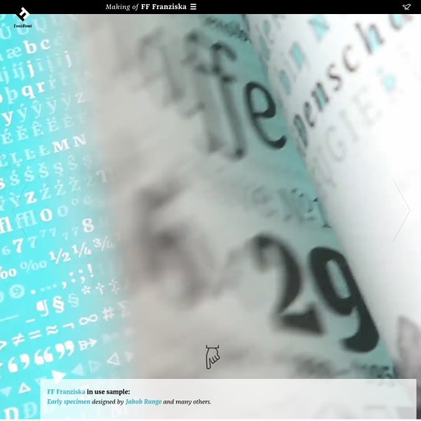
FF Franziska
A really unusual specimen. Presented as a long-form article documenting the design features, history, and inspiration for the creation of Franziska.
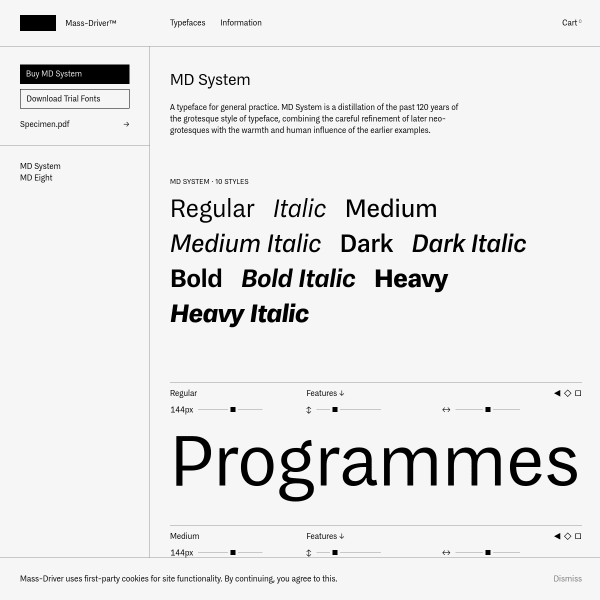
MD System
A simple but effective specimen for MD System from Mass Driver. Unusually, no type tester. Instead, a prominent download button for trial fonts and a PDF specimen.
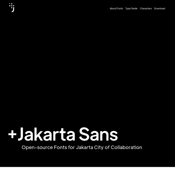
Jakarta Sans
A simple specimen for a workhorse of a typeface. Jakarta Sans, an Open-source font for Jakarta city has some really interesting alternates that, when combined, take Jakarta Sans in a really interesting direction.
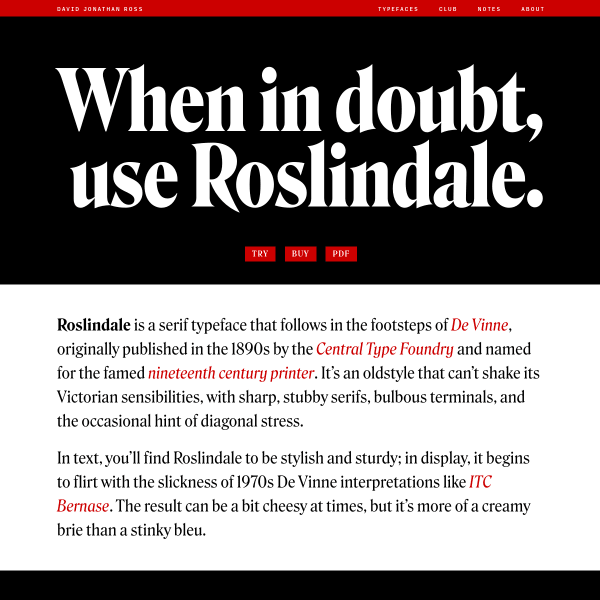
Roslindale
Another solid specimen from David Jonathan Ross. The Rosindale specimen opens with single words set in large bold weights before drilling down into more detail and origin content from David.
British Standard Type
This is an interesting website from British Standard Type that is part specimen, part client case study. Walking through each of the custom projects for their clients, the case study starts to then include comon design patterns from specimens.
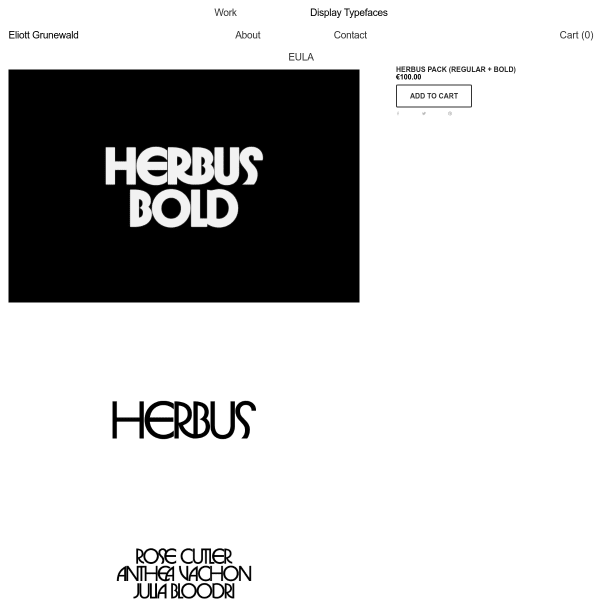
Herbus Pack
Despite this being a scrollable stack of images, instead of webfonts, there is clarity and purpose in the content. Bold, black and white illustrations of the typeface give an indication of usage.
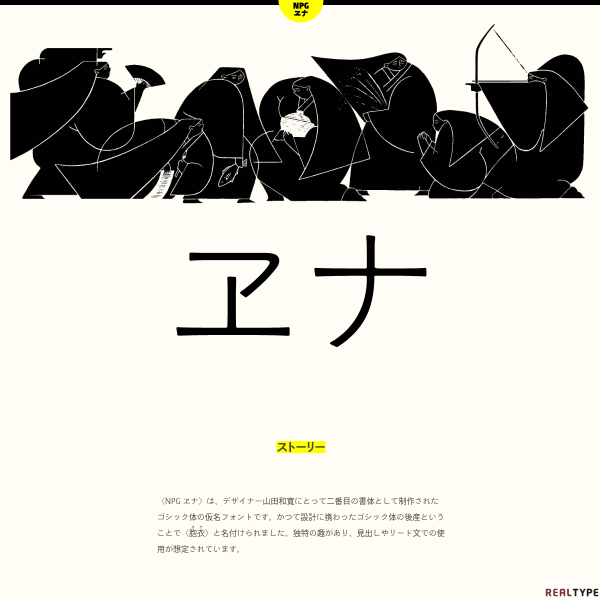
NPGヱナ
This specimen from Nipponia demonstrates how difficult it is to make webfont specimens for CJK fonts without some kind of dynamic subsetting. What is striking is the illustration and the simple information architecture.
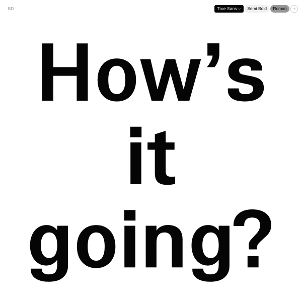
True Sans
An interesting specimen with a large setting of a random question posed to the user. As a type specimen, there is plenty missing from this: glyphs, features, a more conventional type tester. But as a digital experience, it is noteworthy.
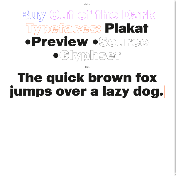
Out of the Dark
There is a lot to like about this website for Out of the Dark. The whole thing is a specimen, with innovative, exploratory modes of navigation and discovery.
Garçonne Display
A nice interactive display of the variable nature of Garçonne Display opens the specimen. The cursor-jacking can be forgiven for the nice, large call to action to interact with the paragraphs.
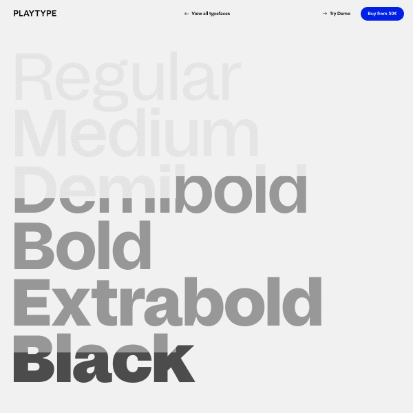
Studio 6
The specimen for Studio 6 from Playtype is simple and bold enhanced by a parallax scrolling panel containing the meta data for the typeface.
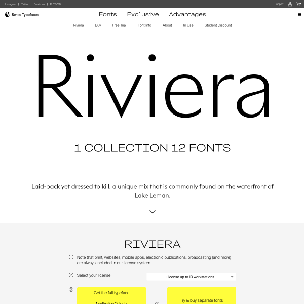
Riviera
Bold, with a flash of colour revealed on scroll, the specimen for Riviera starts with an impactful visual statement. The introduction of the colourways is then followed through the design for calls to action and coloured panels.
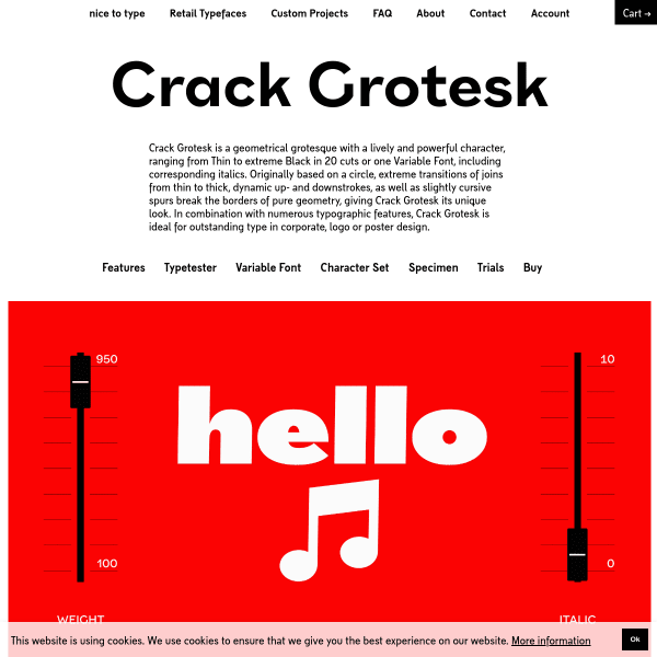
Crack Grotesk
A fun specimen with cute music-related illustrations demonstrate the versatility of Crack Grotesk in an engaging way. Panel and panel of explanatory design notes walk the user through the various features.
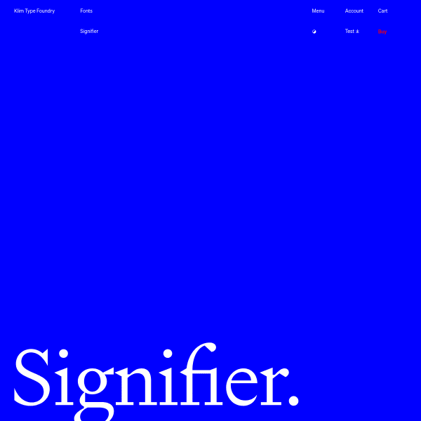
Signifier
Every new specimen from Klim is worth a mention. Signifier is a new 'brutalist response to 17th century typefaces'. The specimen is clear, responds to the user's needs, and is stripped back of content. As is typical with Klim's releases, the accompanying blog post is a fantastic essay detailing the typeface's origins and creation.
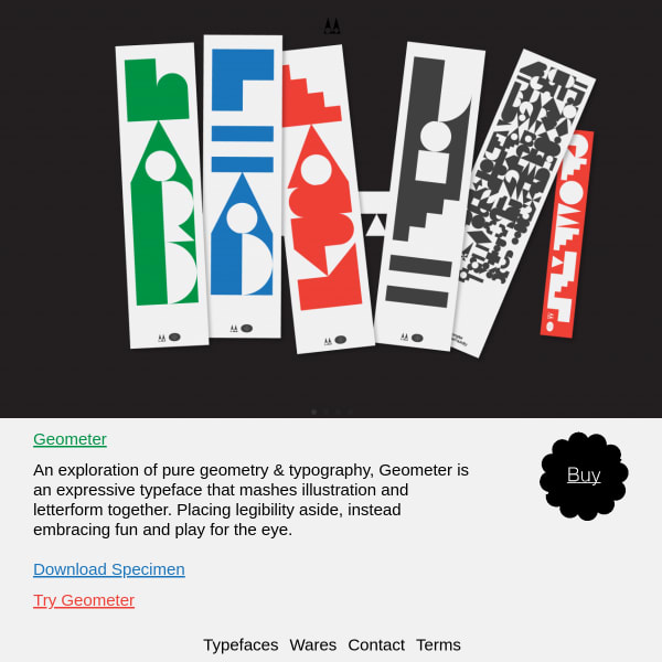
Geometer
An exploration of pure geometry & typography, the specimen for Geometer is fairly conventional but shows the typeface's best features well.