A curated list of digital specimens
of the highest quality. Updated daily.
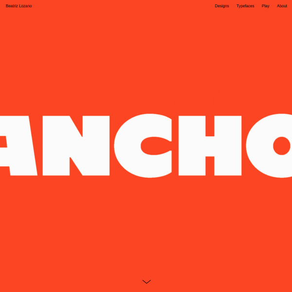
Ancho
Apparently inspired by the peppers of Mexican cuisine, Ancho is a bold, brash, commercial looking typeface with some interesting quirks. The ultra bold weight is my favourite. The specimen is broken up into horizontal containers and it starts getting interesting as you get down into the display of the alternates and features of some of the letters. *enormous* type. Bold, unforgiving forms that look fabulous in a web browser.
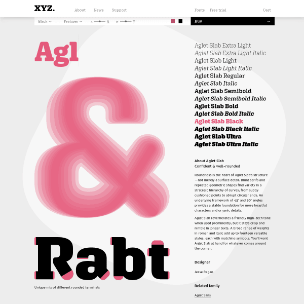
XYZ Type – Fonts – Aglet Slab
I'm a big fan of this specimen. It's clear, leads with tools that allow me to get stuck into some typesetting and evaluation, before closing with some features and a little content about the typeface. The type tester is particularly good, not only offering the standard size and weight controls, but also leading and more advanced features. We're seeing more specimens now with type testers edging towards this.
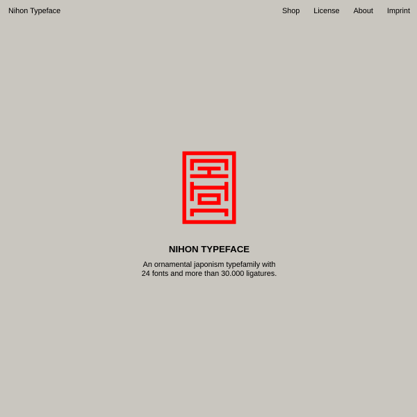
Nihon
An ornamental Japanism typefamily. Inspired by traditional Japanese Inkan-Seals, Nihon takes abstracted latin letters and presents them as used by the seals. A complex goal, but the specimen walks through the results before digging into some features.