A curated list of digital specimens
of the highest quality. Updated daily.
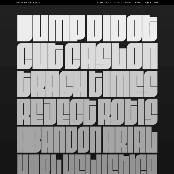
Fit
FIT is a hyper-stylized series of caps designed with one thing in mind: filling up space with maximum impact. As a variable font with extremes of weights, from the super condensed, to the very, very wide, the specimen for FIT displays this perfectly. Stacked panels of text with anchor controls to stretch them. Brilliant.
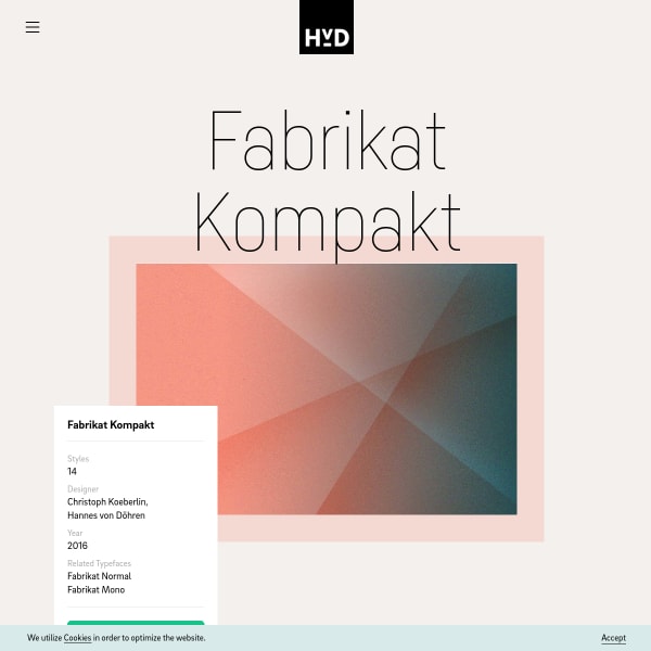
Fabrikat Kompakt
A functional specimen from HvD Fonts for Fabrikat Kompakt but notable because of the opening branding/illustration. Clean, simple, graphical lines present the typeface in simple juxtaposition. Another nice touch is the long-form feature explanation with toggles to see the difference.
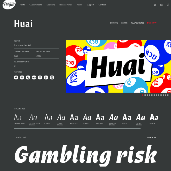
Huai
This templated specimen from Positype is notable for the glyph table. In particular, I felt the preview of the glyphs – which are shown on click – display that choice in the context of other glyphs either side and simple cap height, x-height and baseline metrics.