A curated list of digital specimens
of the highest quality. Updated daily.
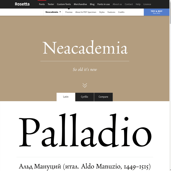
Neacademia
Neacademia is a Latin and Cyrillic type family inspired by the types cut by 15th century Italian punchcutter Francesco Griffo for the famous Venetian printer and publisher Aldus Manutius. The specimen is available in Latin or Cyrillic which is nice – so often language support is shown in the glyph table, rather being set as text.
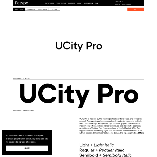
Fatype
Almost every bit of type on this specimen is a type tester. Controls reviewing themselves on hover, they are stacked, starting with huge single words before slowly changing into more long form content all the way to paragraphs.
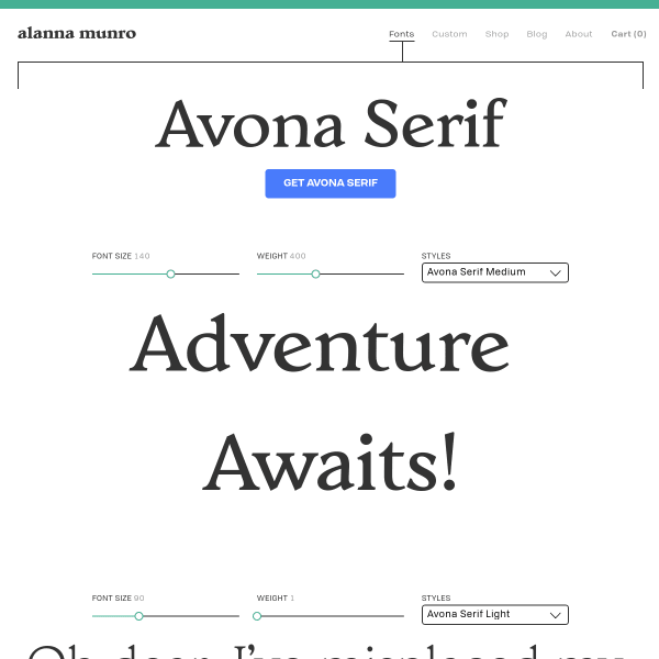
Avona Serif
Another specimen where the buying options caught my eye. A multitude of boxes – each labelled with the font packages, ranging from Personal, to Large, allow the user to easily choose. The one thing that caught my eye was the 'pay-what-you-want' for non-commercial and testing purposes. An interesting alternative to limited trial fonts.